Before / After Problems + Process Key Screens Learnings
01
PRJ::001 · Brand Identity + Product Design

THEOUTPOST

Year
2023 — 2024
Client
Triveous Technologies
Role
Brand + Product Designer
Duration
6 weeks
Platform
Web · Mobile

An AI tools directory built for the modern internet. I was handed a generic blue product with no identity — and delivered a complete brand system, dark cinematic UI, and design language from scratch across web and mobile.

Logo Brand Identity UI Redesign Design System Web + Mobile UX Audit
Scroll
THE OUTPOSTBRAND IDENTITYLOGO SYSTEMUI REDESIGNDESIGN SYSTEMWEB + MOBILEUX IMPROVEMENTSDARK THEME THE OUTPOSTBRAND IDENTITYLOGO SYSTEMUI REDESIGNDESIGN SYSTEMWEB + MOBILEUX IMPROVEMENTSDARK THEME
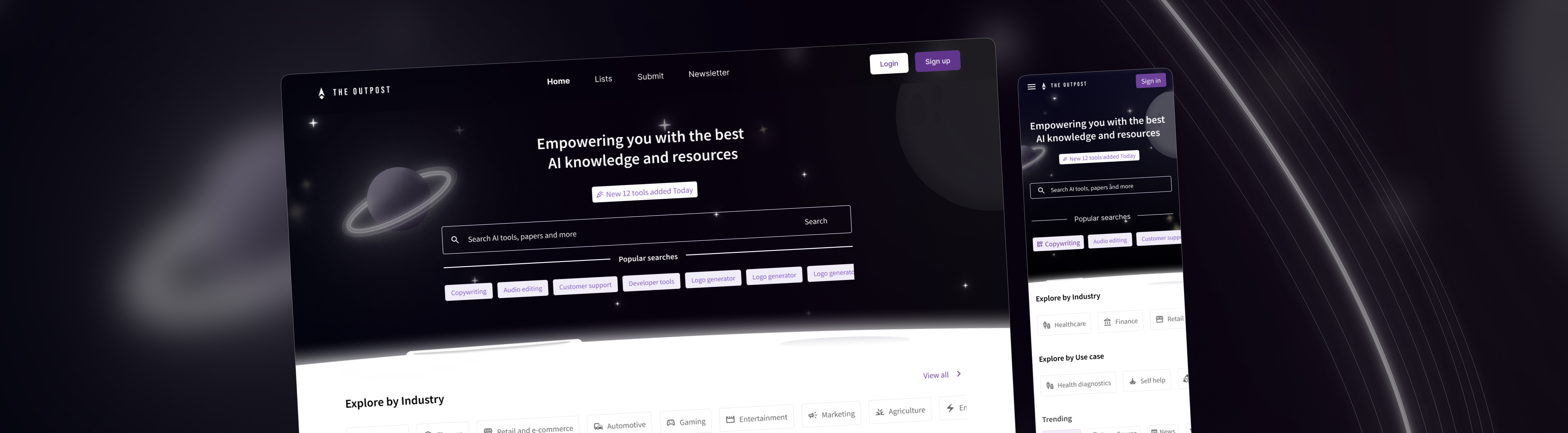
// 01 — THE TRANSFORMATION

Before vs After

Same product. Completely different world.

Before — Previous Direction
GENERIC · BLUE · FORGETTABLE
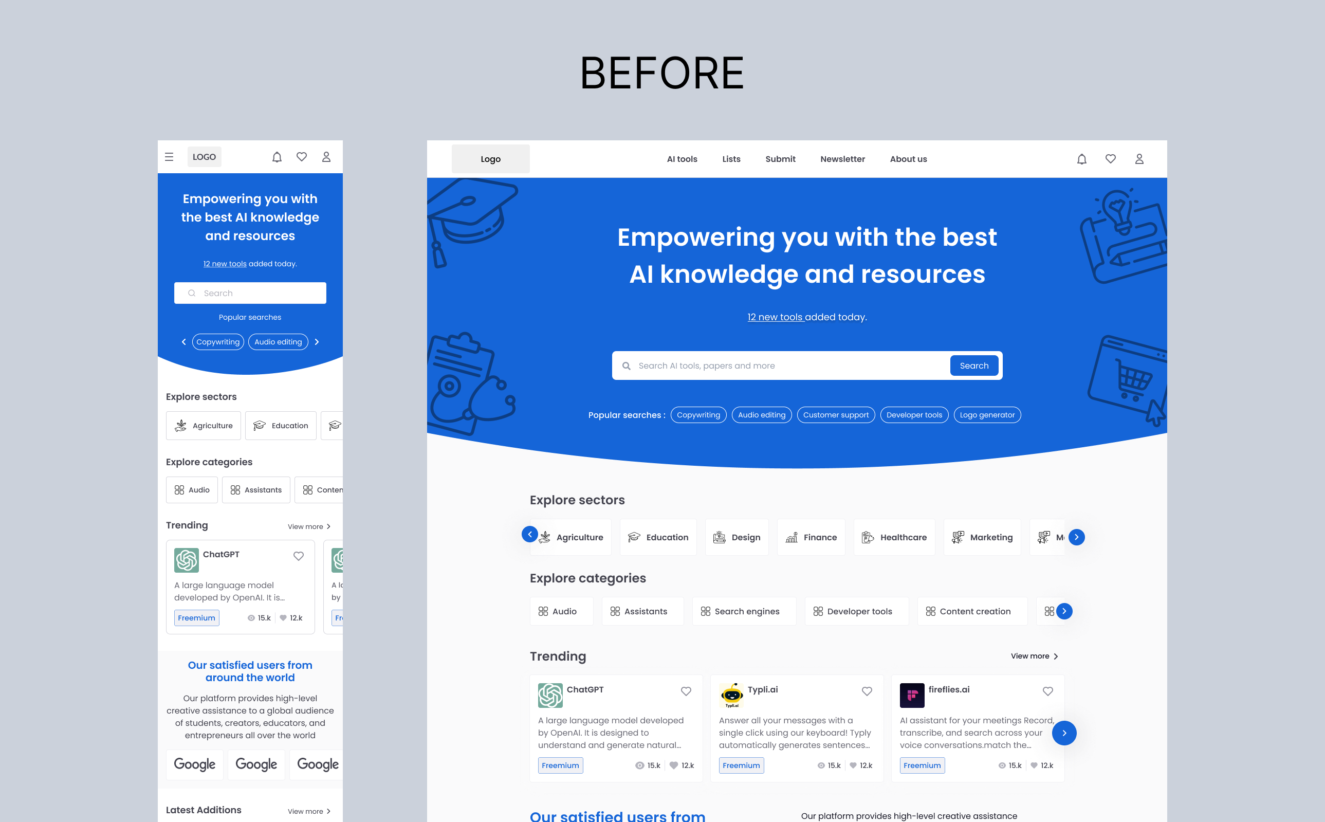
No identity. No personality. A blue interface that could have been any product — nothing to trust, nothing to remember.
After — The Outpost Rebrand
DARK · CINEMATIC · OWNED
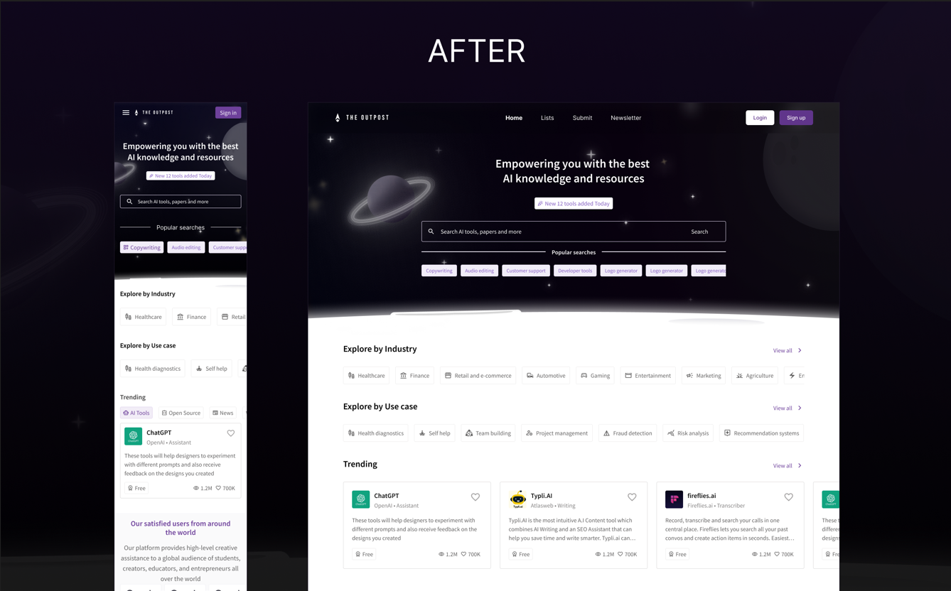
A product that feels like a destination. Custom mark, intentional hierarchy, space aesthetic — every decision earned.
// 02 — THE PROBLEM + PROCESS

What I found. How I worked.

Four problems. Four phases. Brand first — everything else followed.

Problems identified
ISSUE::01
No Brand Identity
Zero visual language. The product looked borrowed, not owned. First priority: build a mark that could carry everything.
ISSUE::02
Generic Visual Direction
Blue + white blended into competitive noise. Needed to be dark, cinematic, and immediately distinguishable.
ISSUE::03
UX Issues Throughout
[ Your specific findings here — sticky CTA missing on mobile, content ordering problems, filter gaps, etc. ]
ISSUE::04
No Design System
Every component was an island. Scaling would have required rebuilding from scratch without a system underneath.
How I worked
PHASE::01
Brand Discovery
Competitor analysis. Defining the tone — authoritative, curated, cinematic. Four logo directions explored.
PHASE::02
Identity System
Chevron-in-circle mark. Dark palette. Wide tracking. The O moment in the wordmark. Light + dark variants.
PHASE::03
UI Architecture
IA audit. UX issues mapped. Full retheme in the new visual language — dark, precise, purposeful.
PHASE::04
System + Screens
Design system built. All web + mobile screens delivered. [ Add your specifics here. ]
// 03 — THE WORK

Key Screens

Every screen had a job. Homepage earns trust. Tool detail converts. Listing enables discovery. Mobile keeps it alive.

HOMEPAGE
Hero · Explore by Industry · Trending
TOOL DETAIL
Product Overview + Media Gallery
TOOL DETAIL
About Company · Featured Lists
INTERACTION
Product Gallery Lightbox
INTERACTION
Add to Lists · Favourites
LISTING
Category Page · Filter System
ARCHITECTURE
Site IA
INTERACTION
Share Dropdown
// 04 — WHAT I TOOK AWAY

Learnings

What this project actually taught me — beyond the deliverables.

Inheriting Is Harder Than Starting
Redesigning an existing product means understanding every decision before you change it. The constraints aren't obstacles — they're the brief. Working within them made the solution sharper, not safer.
Brand and content Before UI — Every Time
Once I locked the identity and story, every UI decision became faster and more confident. When you know what a product should feel like, you know instantly whether a component belongs.
Run before you walk
Letting go of your fear of learning new things on the go is definitely the move. Using your logical skills and the internet is a makeshift fix that delivers impressive results with a little supervision
Don't solve when there is nothing to solve
Sometimes the best design decision is to see what doesn't work and fix just that. It's easy to get carried away during a redesign and start fixing things that aren't broken.
Back to All Work
// NEXT PROJECT
Infiniti