Two streams of work — the invisible architecture that makes navigation feel effortless, and the
features that make knowledge work powerful.
FEAT::01
Left Navigation
Grouped into Your Notes, Productivity, and Organise. Collapsible, searchable,
keyboard-navigable. Folder hierarchy with unlimited nesting. Every decision tied back to a persona
need.
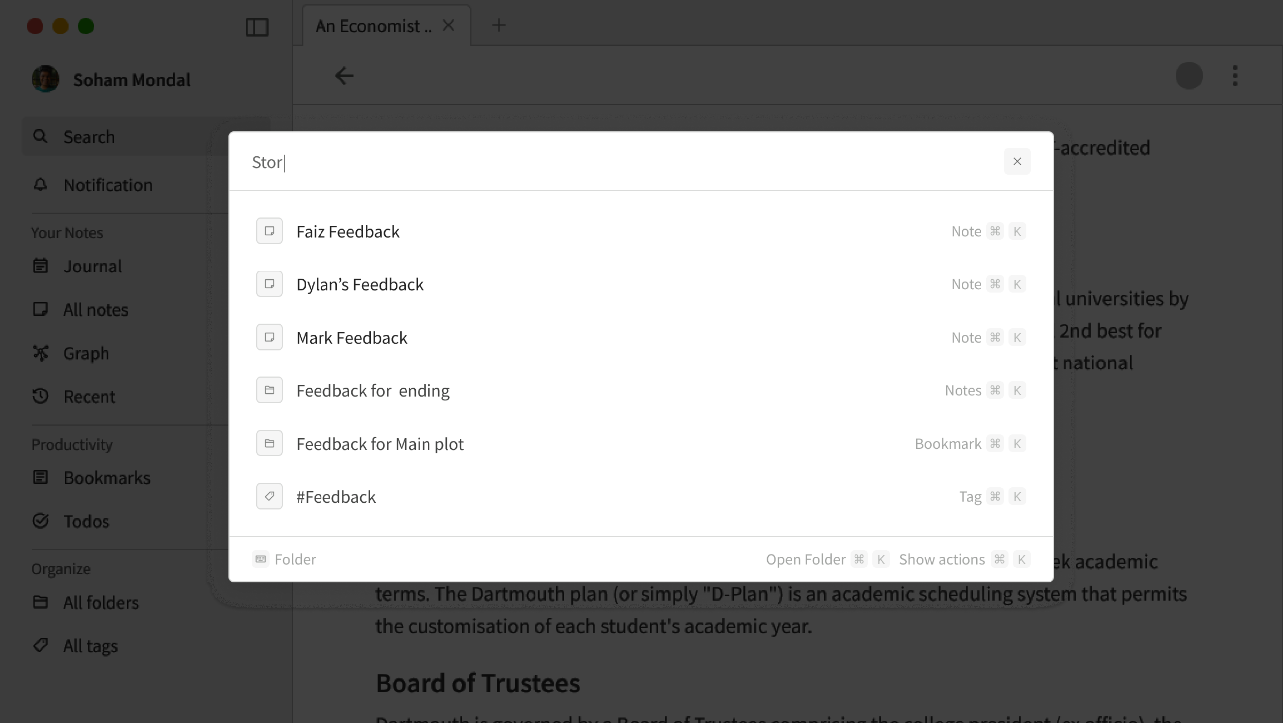
FEAT::02
Search
Designed from scratch. Stress-tested with complex real-world scenarios —
searching across notes, bookmarks, folders, tags simultaneously. Command-palette style with keyboard
shortcuts.
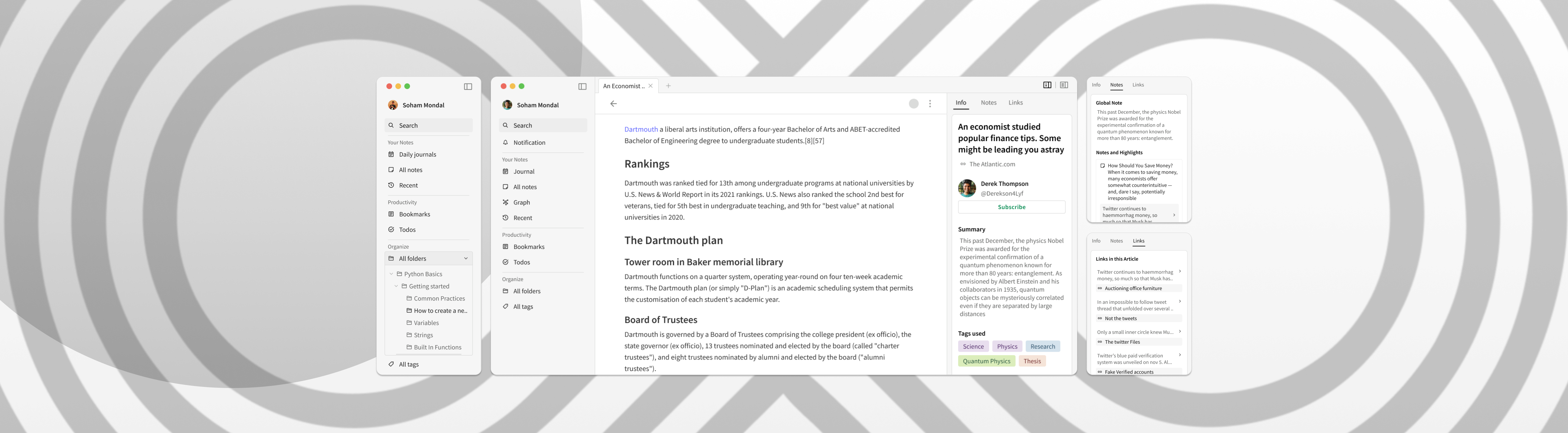
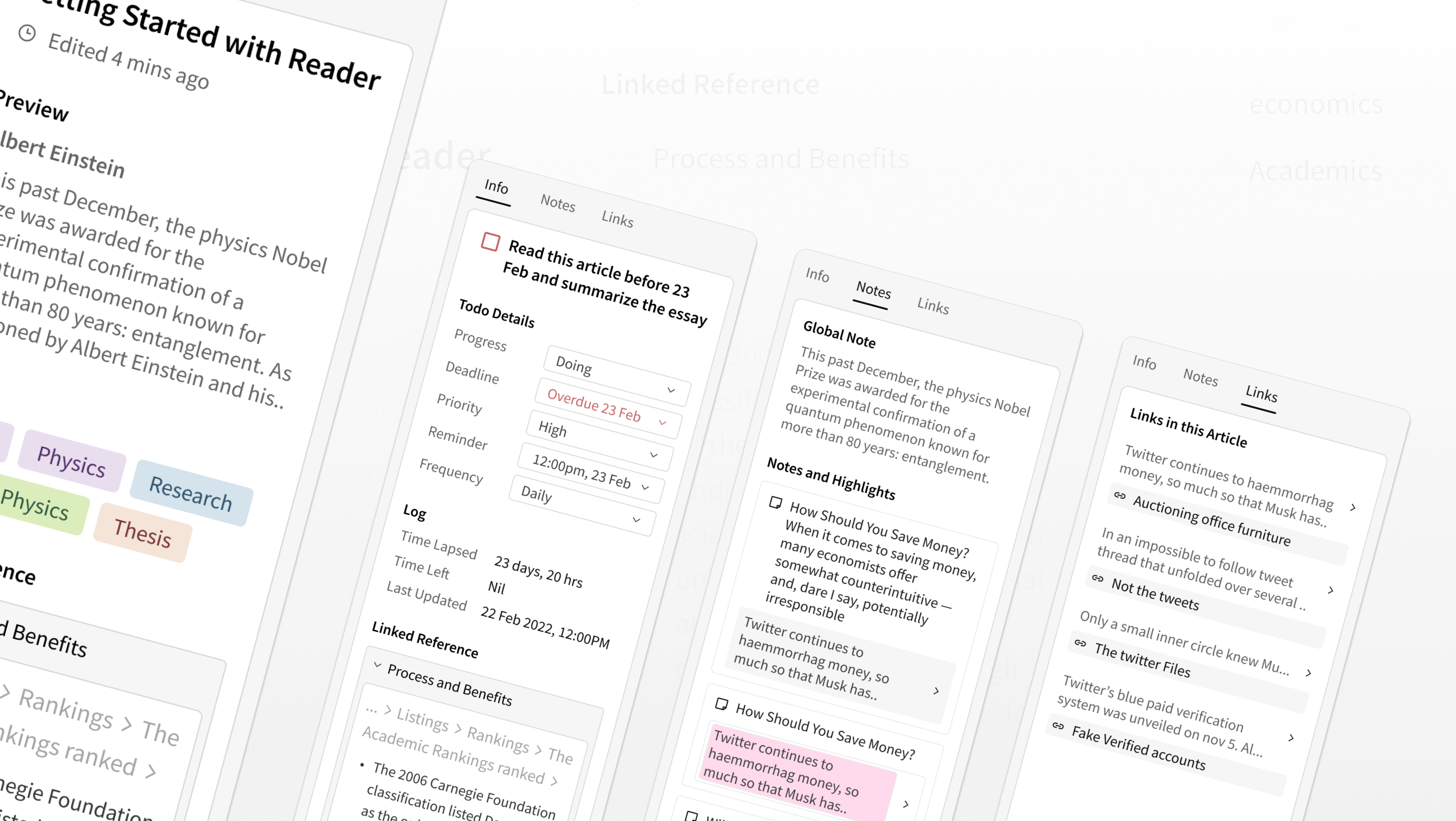
FEAT::03
Right Sidebar
Two modes: Information (metadata, tags, summary for the active
bookmark/note/todo) and Reference (backlinks, filed and unfiled connections). Multitask
without losing context.
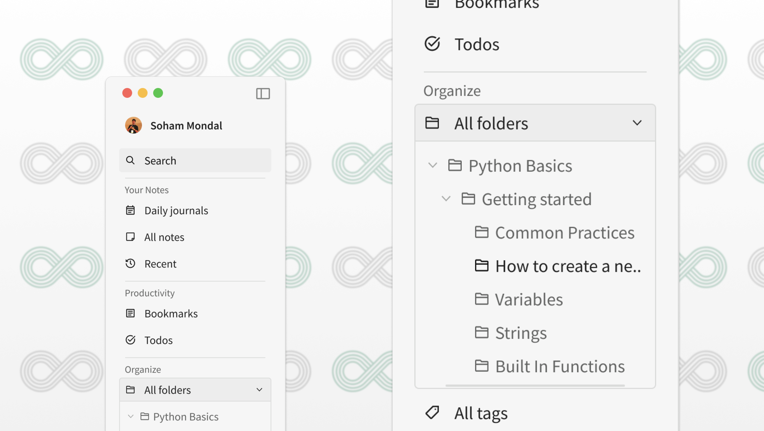
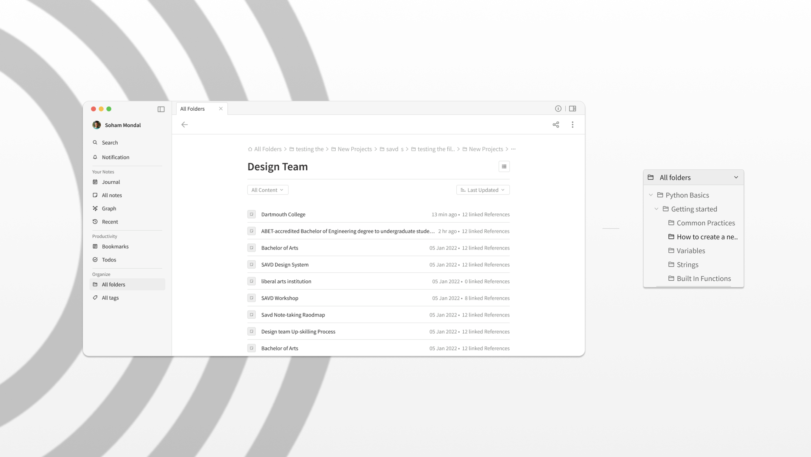
FEAT::04
Folder System
All Folders page with date and content filtering, alphabetical sort. Folder in
left nav with expandable hierarchy — Python Basics → Getting Started → Variables, Strings,
Functions.
FEAT::05
Quick Commands
Universal command palette. Search across everything — notes, bookmarks, tags,
folders — with keyboard shortcuts for every action. For power users who never want to touch the
mouse.
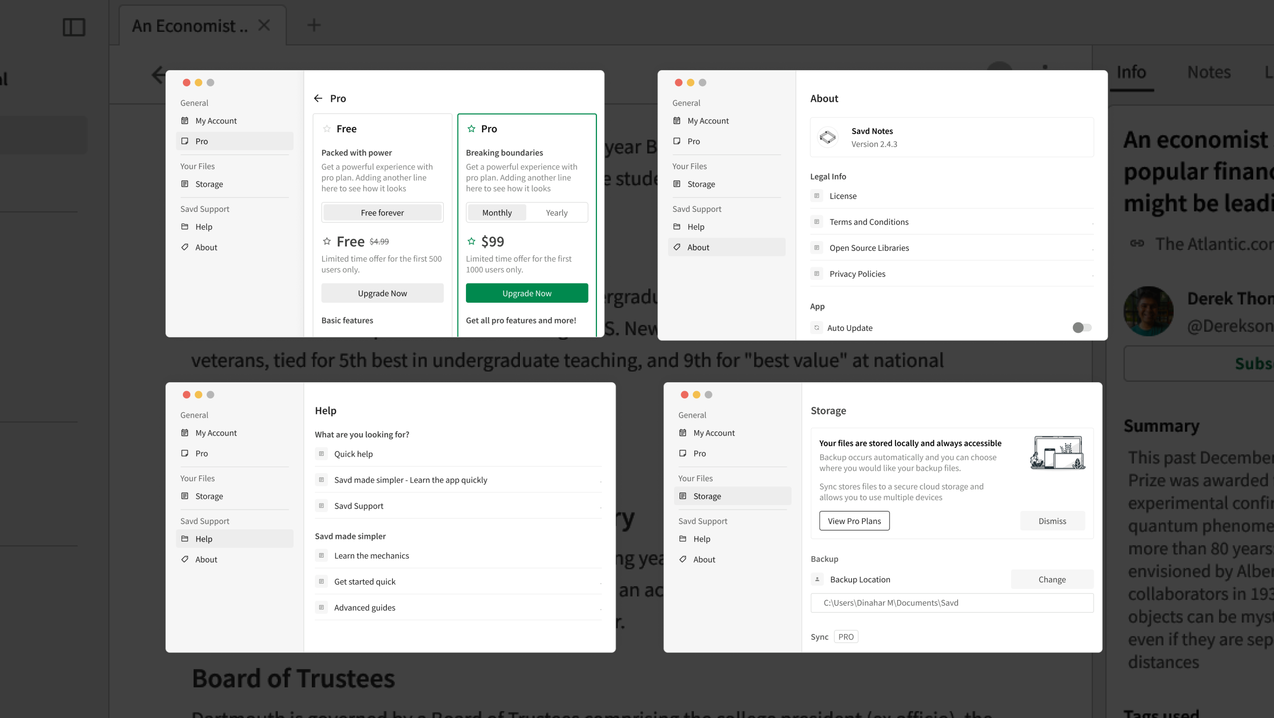
FEAT::06
Settings
My Account, Pro/pricing, Storage, Help, About. Clean two-panel layout.
Storage shows local-first philosophy clearly. Pro upsell designed without being pushy.